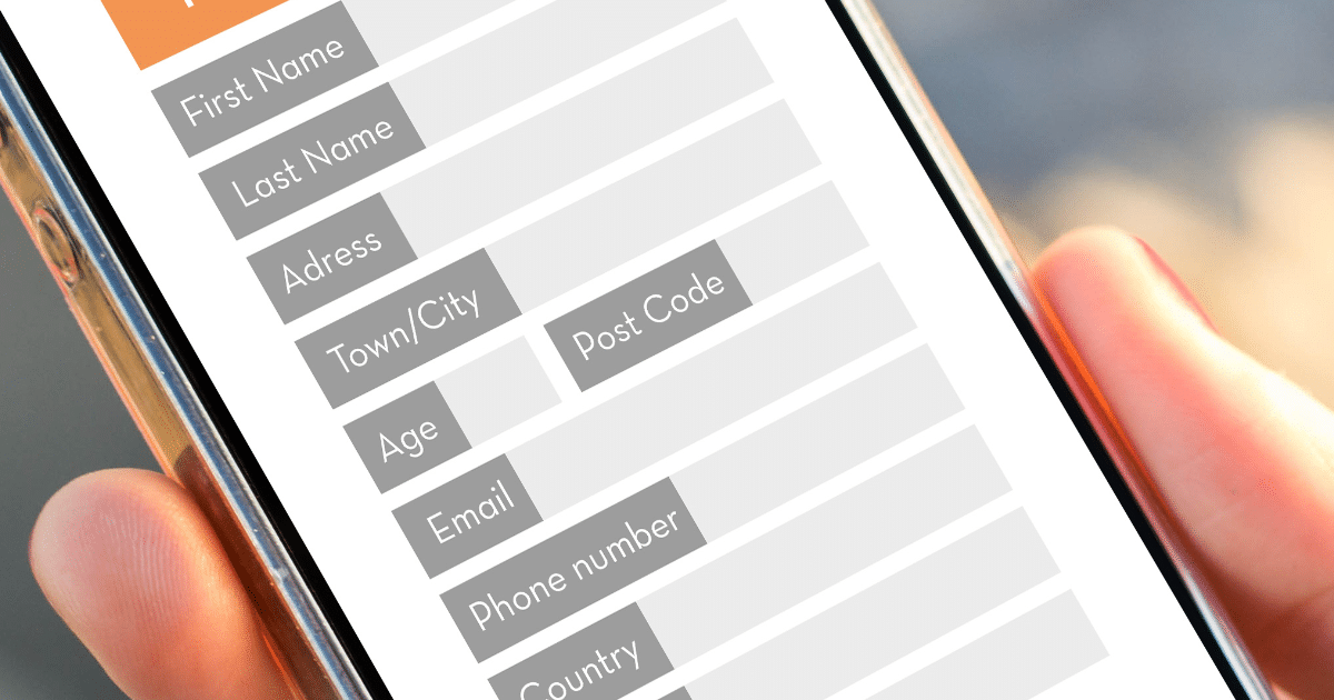
The use of online forms has been getting a bit of a bad rap lately, but truth be told, online forms are still the easiest way to collect user information and make premium content exclusive.
In one way or another, every website utilizes forms, whether it’s to capture lead data, gate premium content, or to facilitate event registration. Form design is incredibly important because it can make the difference between generating a new sales lead and causing a visitor to bounce.
Prospects who visit your website can sometimes become annoyed by interstitial forms that ask for personal information. On the other hand, the right form that shows up at the right time in a relevant context can increase engagement rates and open up a dialogue with new prospects.
In line with this, online forms are an incredible tool for B2B lead generation. They can be utilized in various ways, allowing you to get the information you need to build a database that you can use for the distribution of your marketing communications.
Online forms make everything easier. They allow prospects to leave a message that you can respond to at your own convenience. Sure, it’s important to respond quickly, but most organizations don’t have the resources to facilitate live communications 24/7.
Below are some of the different online forms you can use for your website, along with some tips you should know to make sure you’re doing it right.
Types of Online Forms
1. Newsletter Signup

Newsletter signup forms are quite simplistic, only ever requiring one or two fields for users to submit. When a user submits a newsletter signup form, they’re expressing a desire to consume your content on a regular basis. This opens a channel for marketing communication.
Newsletters are one of the best ways to generate and nudge leads towards loyalty and advocacy. The act of keeping in touch with a brand makes a user all the more likely to engage and keep the brand top-of-mind when a purchase decision is ready to be made.
2. Sales Contact
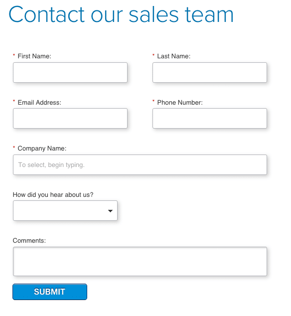
Sometimes, a prospect is done with the consideration stage and ready for the sale to happen. You can collect their information and lead them directly to your sales team without breaking a sweat.
Do keep in mind that a sales contact form is NOT the same as a form on your “contact us” page. It’s a form that asks for sales-specific information and connects them directly to the sales department as quickly as possible because they’re just about ready to make a purchase.
3. Event Registration
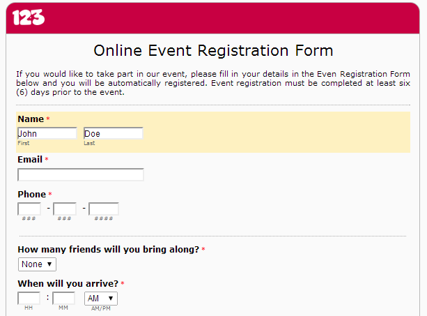
Putting on an event can be a challenging task, but with an online form focused on managing your attendees, you easily deliver event-specific information such as rationale and basic details like time, venue, event schedule, and how to RSVP.
4. Customer Feedback
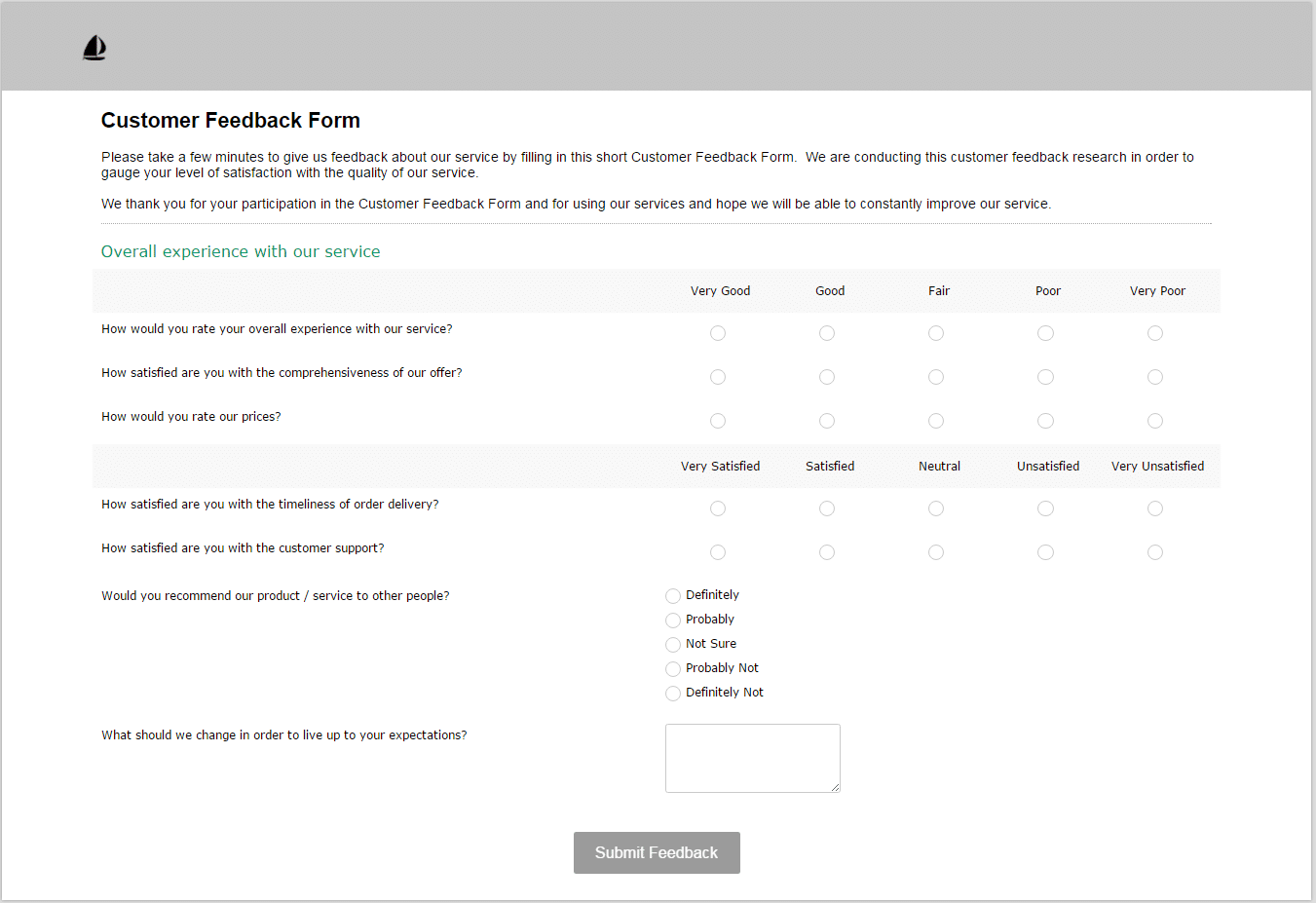
These forms/surveys come after your customer has received the product or service. There are certain questions you might want to ask here like:
- How satisfied were you with the product/service?
- How satisfied were you with the sales process?
- How likely would you be to recommend us to a friend?
- How did you hear about us?
This information will be useful to determine your business’ next steps in performance evaluation.
5. Online Order and Payments
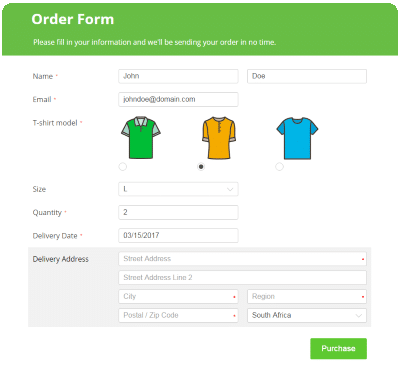
Whether you’re selling a product or service, prospects should be given the option to purchase at their convenience. So, it’s a good idea to include an online order and payment form on your website for immediate sales conversions.
It just seems counter-intuitive to make your customers wait before they can pay you, so it’s up to you to make the purchase process as easy and convenient as possible.
6. Account Signup
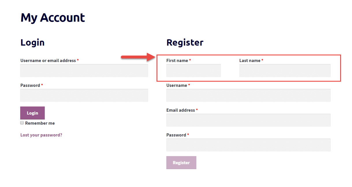
Social media websites utilize account signup forms to collect user registration data before granting access to exclusive content. Take Facebook, Twitter, and Instagram for example. Users can’t engage with these platforms unless they create an account.
If you’re a business that requires membership, you can also utilize this form. It doesn’t put pressure on your customers to commit right away. You can always send them marketing communications in the future to drive them towards a purchase decision.
7. Website Visitor Feedback
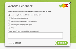
This type of form is for businesses that are trying to discover and segment their online audience. You can’t assume that these people are the same as your customers because, well, they’re just website visitors.
However, the information you get from this feedback form can still help you determine where improvements can be made on your website. This is great for testing different design layouts and UX best practices.
8. Contest Registration
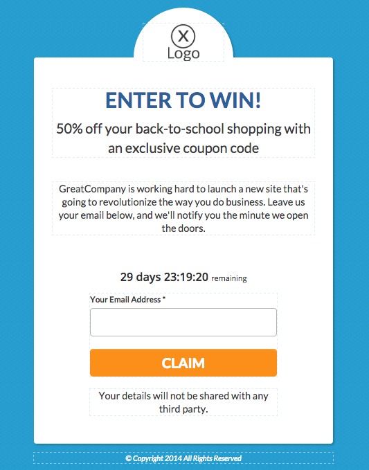
As the name suggests, this is a form that allows users to register for a contest entry. Contests are highly-engaging strategies that can help build brand awareness.
Although users will submit this form predominantly for the chance of winning a prize and nothing more, you should still follow up with them after the contest ends with the goal of converting them from contestants to sales leads.
9. Donation
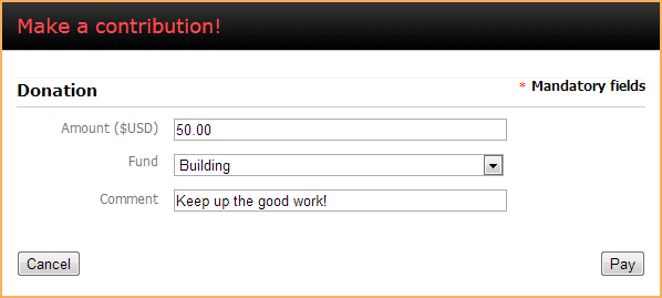
Supporting causes is far easier with the help of a donation form. Just like with order and payment forms, your customer’s information should be safely secured in an organized database.
Your customer’s information can be your gateway to offering them more opportunities such as event invites and other donations they can place in the future.
10. Free Assessment/Audit
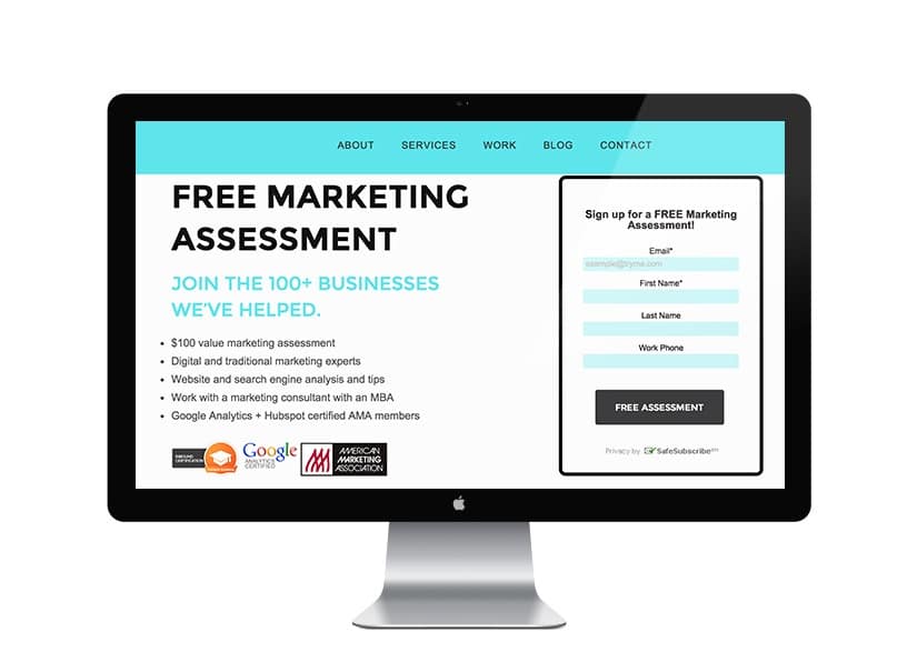
Offering free assessments is an effective way to generate leads for businesses, especially for B2B SaaS companies. And it takes a certain type of form to entice users to sign up.
Free assessment forms are brief, only containing a minimal number of fields like name and email address. The point of a free assessment is to show prospects the potential value of your service, so remember to make the signup process as easy as possible.
Best Practices for Signup Forms
Now that you know your signup form options, what does it take to have a high-converting landing page?
- Keep It simple. Complex online forms will only overwhelm and drive your customers away. A good rule-of-thumb is to only ask for the information you really need for the next stage in the marketing/sales process.
- Optimize for mobile. Because mobile devices now account for more traffic than computers, it’s highly recommended that you make your form mobile-friendly.
- Mobile is all about speed and accessibility. If the font is too small to read or the buttons are too hard to press, you’ll be killing your chances for mobile conversions.
- Point and guide. Highlighting the current field they’re typing in or allowing prefilled data will definitely be appreciated by your customers. Also, you should implement an input validation system to notify them if they make any potential errors, so they can immediately rectify them before hitting the submit button.
- Minimize typing. As I’m sure you already know, typing on mobile devices isn’t nearly as easy as doing it on a computer. That’s why it’s a good idea to minimize the need for typing by including dropdown boxes and other selectable fields.
- Avoid custom questions. The greater the number of custom questions a potential lead has to wade through the less likely it is that she will follow through and download the asset. The custom questions having smashed any interest she might once have had in the white paper, infographic or webinar on offer no matter how persuasive or compelling that content might be.
Key Takeaway
There’s no easier way to generate leads then to allow prospects to give you their information and consent. Just keep in mind that there’s a specific type of form for pretty much everything. Keep a reference of these tips to make sure you’re using the right one when the time comes.


